I design products that make complicated things simple, then build them to feel good to use.
Seven years designing for software, mostly at SaaS companies where I work across marketing and product. I care most about the part before the pixels: structure, systems, and the reasons behind each decision.
I live and breathe in design tools, but lately I've expanded into the codebase. Left, an iOS budgeting app, is the latest.
Email me or find me on X, here are some projects I've worked on.
LaunchNotes
For three years I designed and built everything LaunchNotes put on the web, working directly with the COO, Head of Product Marketing, and Head of Product. On my own, I rebuilt the site twice (35+ pages each time, plus 2000+ CMS pages), led a full brand refresh, and kept it technically clean with a site health score that stayed at 95+.

Each product got its own color and its own dithered image, so the homepage reads as one system with three distinct parts.
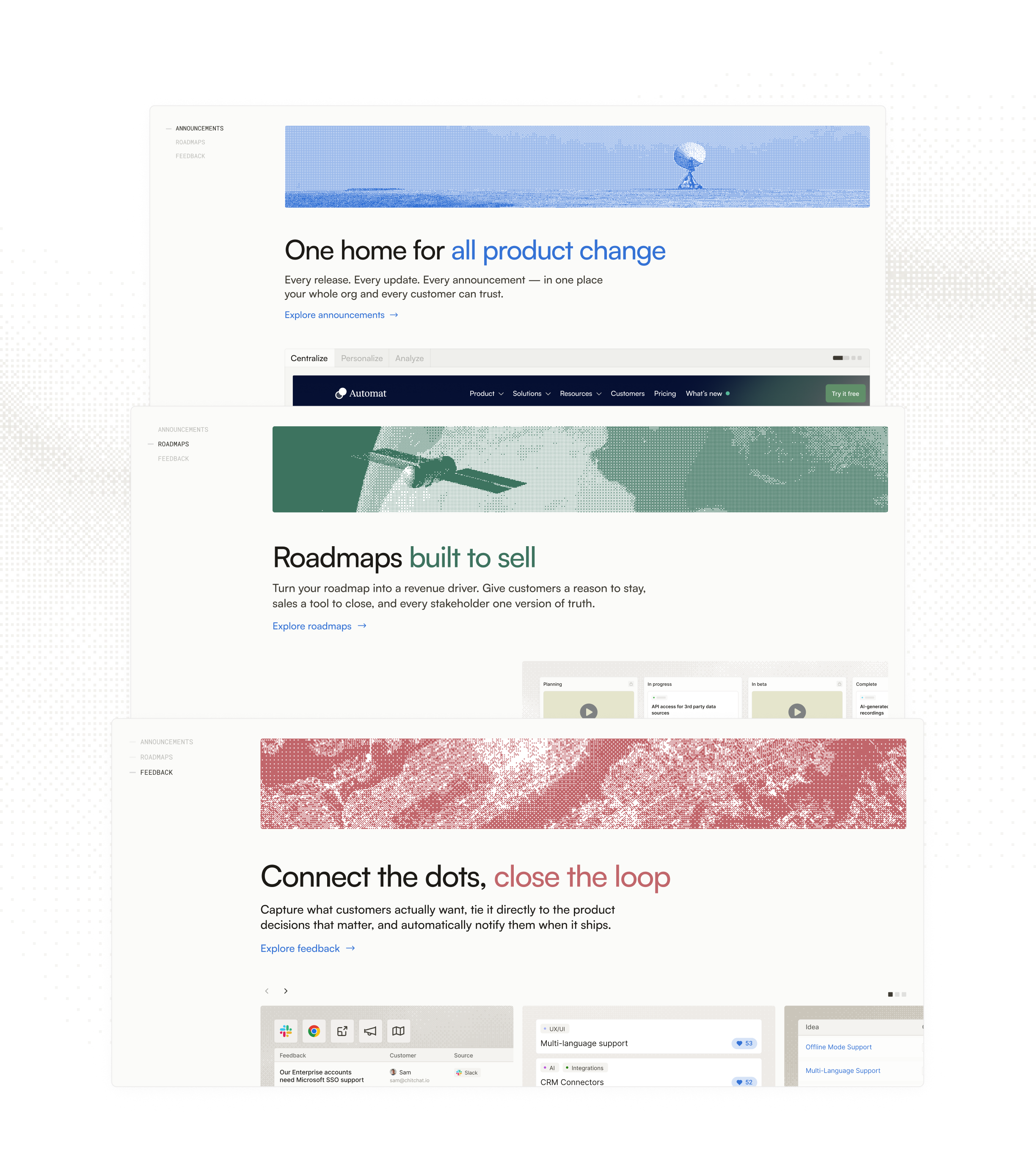
Product design wasn't my role, so I pitched it anyway. The team liked both proposals, but the Dotwork acquisition kept them from shipping.
Dashboard
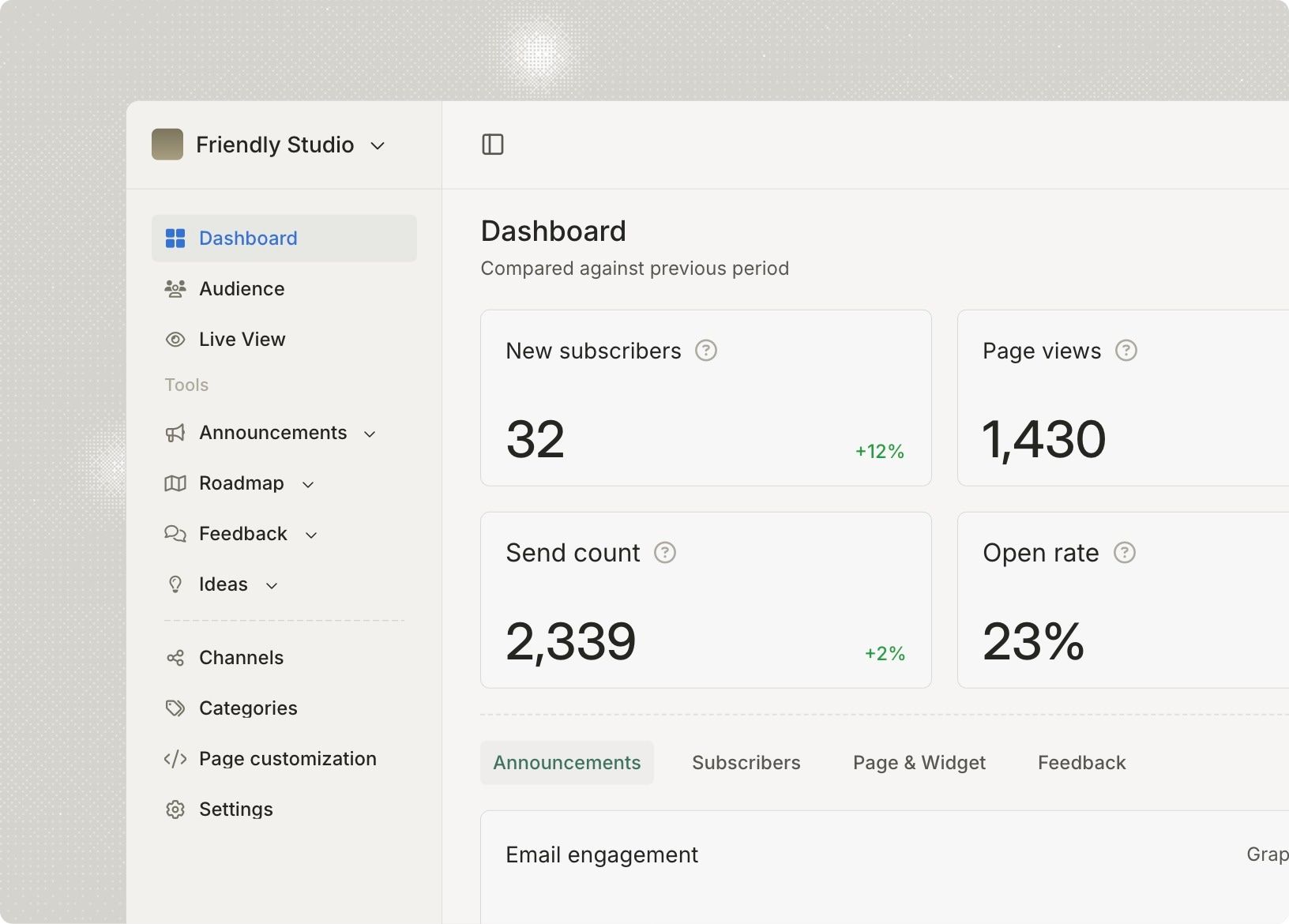
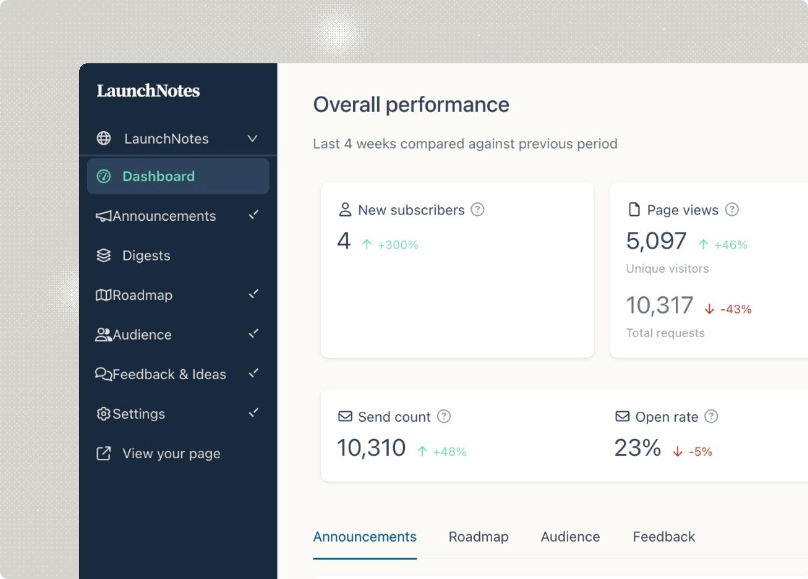
Grouped navigation, even metric cards, and engagement charts you can read at a glance.
Smart drafts
Jira is the best input, but it was hidden behind a generic Add context button. I split the modal into three steps and gave Jira its own view.
Smart drafts demo: choose a template, add context, and draft an announcement. Activate the demo to use its controls. Tab moves through the controls and can leave the demo.
Preview of the redesigned Smart drafts form with template choices and a three-step workflow.
The Release Notes Hub is a guide to release notes, from what goes in one to who owns them. Five numbered sections sit in a sticky nav, and the pages lean on tables and real examples so they read like documentation, not a sales page.
Graph
Graph was the AI teammate the LaunchNotes team built for engineering: connect GitHub and Jira, then ask it anything in Slack. I designed and built graphapp.ai. The pitch happens in Slack, so the site does too. The hero is a live conversation that climbs one message at a time, and hovering pauses it so you can read.




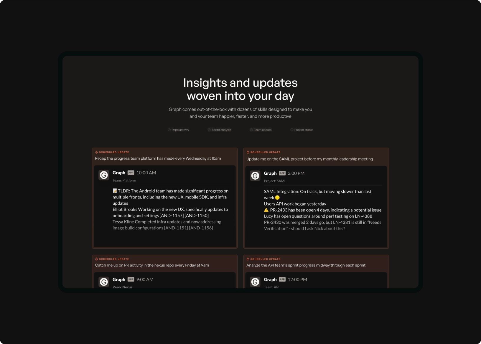
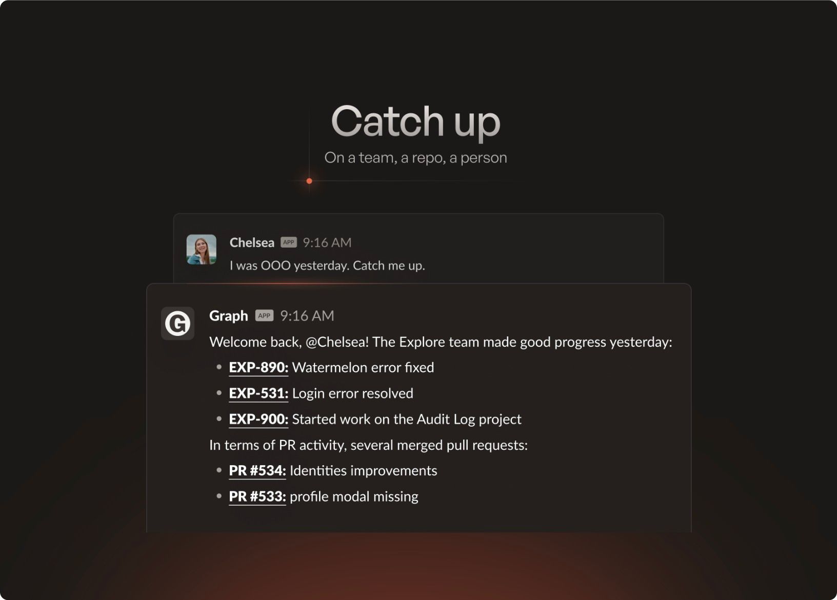
One social graphic out of a set for the Graph launch. Each graphic takes one skill, like catching up after a day out or seeing where the team's time went, and shows it as a single Slack exchange under a short headline.
Left
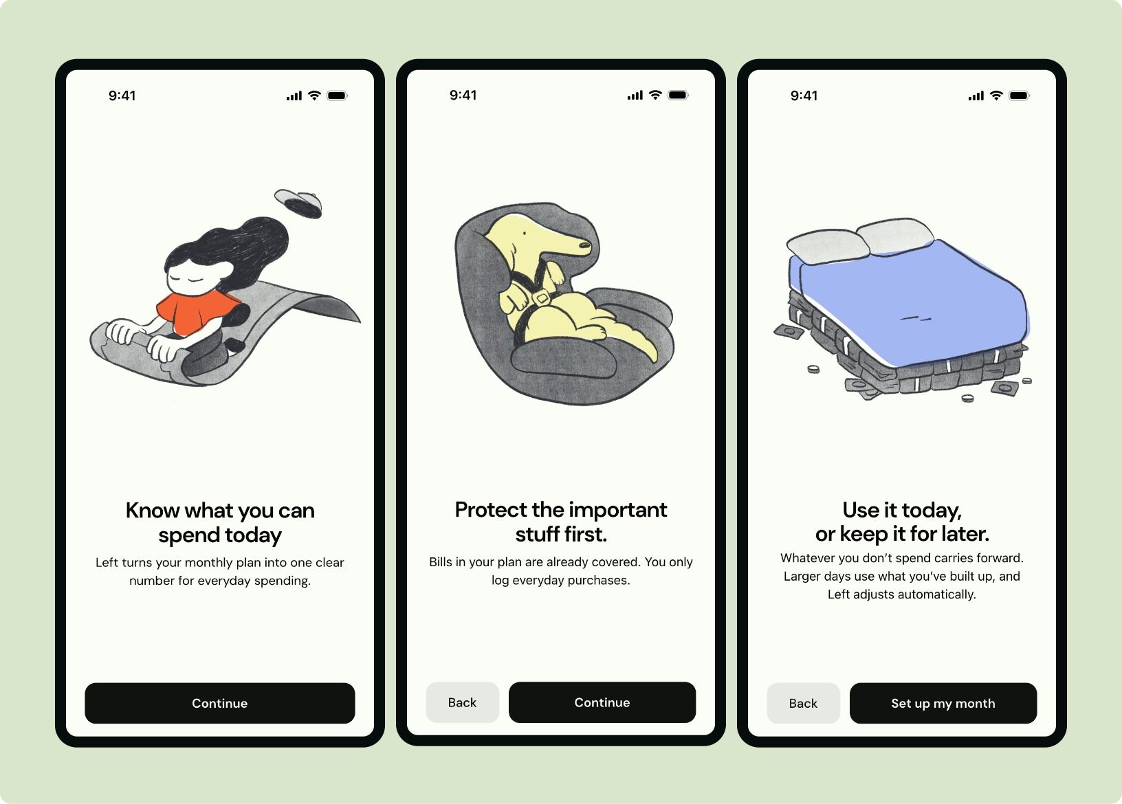
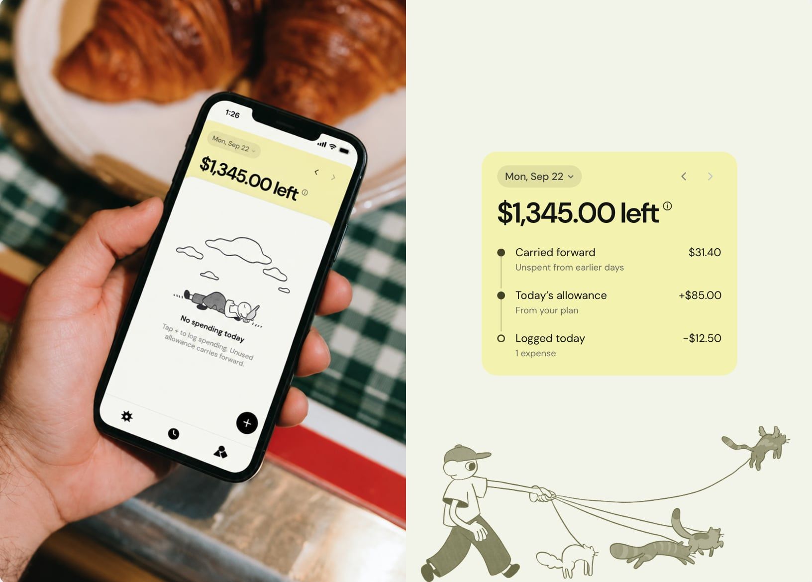
Left shows you how much you can spend today. Add your income, expenses, and savings, and it turns what's left into a simple daily budget.
coming soon
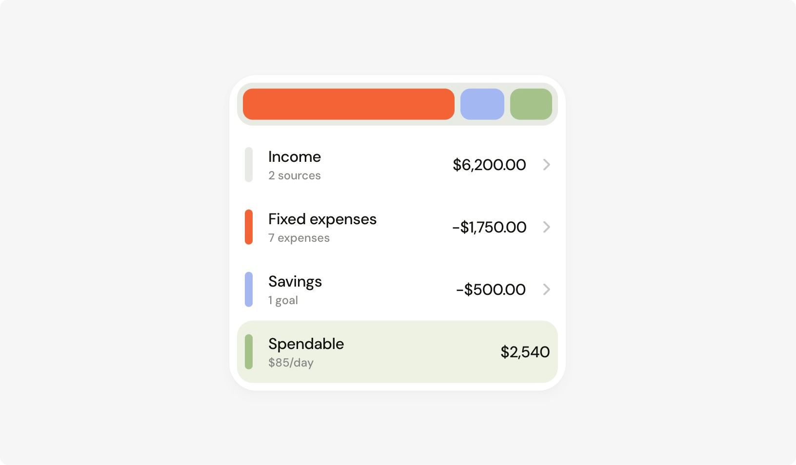
Logging a purchase has to be faster than not bothering. Tap plus, type the amount, pick a category, and you're done. Money you don't spend carries forward, so a quiet day makes tomorrow a little bigger, and the balance card shows exactly where today's number came from.
Nimo Homes
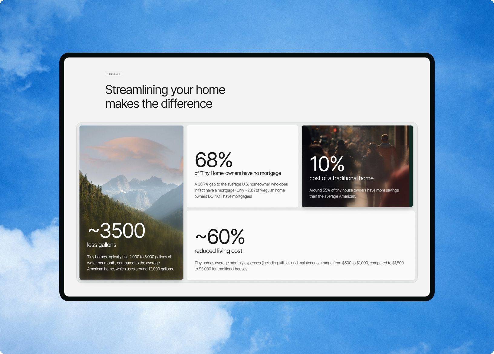
Nimo Homes builds tiny homes for people who want to own outright and live with less. I designed the brand mark and the marketing site. The logo's three house shapes push out from the centre and spin back in, and the homepage leads with the numbers that make the case: less water, no mortgage, a fraction of the cost.
Nobody buys a house from a web page, so the site's job is to start a conversation. The model cards let you compare homes at a glance, and the inquiry form asks only what the team needs for a first call, one step at a time.